Showing posts with label painting. Show all posts

Saturday, December 29, 2018

2019 Painting Giveaway Resolution - AVAILABLE PAINTINGS FOR SALE

Happiest of new years, new beginnings, new potentials...

For the month of January, in our new year of 2019, I have resolved to have a painting giveaway! With the purchase of any of my available paintings below (I have condensed a list to make it easy for you) your name will be entered into the draw, and I will select the lucky winner at the end of the month. I am giving away my Nicaraguan Volcano painting (listed below). Whether you would like to re-gift it or keep it, I am excited to start my year off with a bang and a freebie! This is the beginning of my 2019 resolutions to not be afraid to succeed as a visual artist. Thanks for reading and I hope to receive a message from you ;)

Icy Blue
16 inches x 1 foot
Acrylic paint & texture medium on canvas, framed
$90.00

Lipstick
32 inches long x 2 ft tall, 1 3/4 inches thick
Acrylic paint on board, framed
$150.00 

Abstract Blue Pond
2 ft x 2 ft, 1 3/4 inches thick
Acrylic medium on board, framed
$200.00

It's not quite as teal as it appears in the above photograph; here is a photo of it in my living room for a better idea of the pallette.

Acrylic Fireworks
Approx. 4 ft x 2 ft, 2 inches thick
Acrylic paint on hand-stretched canvas, framed (quite light)
$250.00

 Oil Fireworks
Approx. 4 ft x 2 ft, 2 inches thick
Oil paint on hand-stretched canvas, framed (quite light)
$250.00

Purple Landscape
1 ft x 18 inches, 3/4 inch thick
Acrylic paint and texture medium on canvas, framed
$90.00


Volcano from Ometepe Island, Nicaragua
4 ft x 2 ft, 1.5 inches thick
Acrylic and texture medium on canvas, framed
Valued at $350.00
FREE WITH PURCHASE OF ANY PAINTING DURING JANUARY, 2019
as part of a New Year Resolution Painting Giveaway!

Beauty and the Beast Stained Glass Rose
10 inches x 8 inches
Printmaking; ink and paper (framed)
$50.00
(The only one of its kind)

Serenity Landscape
2 ft x 2 ft, 1 3/4 inches thick
Acrylic paint on hand-stretched canvas, framed (quite light)
$150.00
(The light and colour is not quite accurate in this photograph, but the painting does maintain a level of cloudy atmosphere)

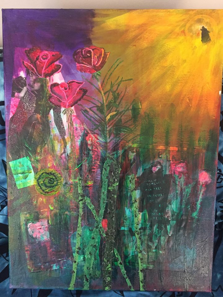
See Howl We Grow
2 ft x 18 inches, 3/4 inch thick
Acrylic paint, mixed media, texture medium on canvas, framed
$100.00

Cherry Blossom - A New Beginning
40 inches wide x 52 inches long, 2 inches thick
Acrylic paint on hand-stretched canvas, framed (quite light)
$250.00

 Blue Tree
3 ft x 21 inches, 2 inches thick
Acrylic paint on board, framed
$350.00

Purple Tree
3 ft x 2 ft, 2 inches thick
Acrylic paint on board, framed
$350.00

Acid Tree
3 ft x 3 ft, 1 3/4 inches thick
Acrylic and glaze medium on board, framed
$400.00

Friday, January 19, 2018

High Contrast - Paintings for Sale

Hi everybody! I would first like to take a moment to thank everyone for their views and their shares. I'm so proud of my work and I'm so excited to get it into your eyeballs and get you talking about it, it makes me immeasurably excited. It amazes me to realize how little of my art I have shared over the years, and I guess it shouldn't surprise me, since I hide it while I paint it then I hide it when it's done. But thank you for being such a generous audience and for allowing me a part of your day to show you what I've been up to these last few years.

So without further ado, let me introduce you to the next couple contestants. Today both paintings are of a similar theme but were completed maybe a year and a half to two years apart. I have not taken professional photos of either of them yet but these are what I do have and I hope you enjoy :)

I would like to make a quick mention before you continue, most of these paintings you can find in smaller print forms at my mom's Giftshop in Rosebud. Should you like one of my paintings but the vastness of the beauty is just too much for you to handle, stop in at the shop and grab a couple prints of your favorite pieces! Okay, shameless self-advertising aside..

I present to you:

Small Round Tree (SOLD)
Dimensions of 16" x 20",  less than 3/4" thick, and acrylic on canvas. It is moody, it is colourful, it is textured, and it is marvelous.

Here you have:

Blue Root
Dimensions of 16" x 20",  less than 3/4" thick, acrylic on canvas. Again, I don't have a professional photo as of yet, but I will, I may even post it on here, and you can find the prints in my mom's shop. Again with the contrast and strong use of colour, and I went a bit overboard with the boarder but I absolutely love the effect. I may have to make more intense boarders as I sell my art and make more!

Both pieces I'm selling for a negotiable $150.00, should someone feel compelled to get them as a set, I would love to give you a great deal :) Let me know, please share if you know someone who may need these in their life, and thanks, as ever, for viewing!!

Wednesday, January 17, 2018

A Landscape of Rosebud and a Dripping Tree

Small Blue Drip Tree (SOLD)

Today I would like to introduce to you to one of my favourites (I know, I say that about all of my paintings). I was inspired for the leaves and the branches by a friend I was painting with that day who uses a lot of swiggly wiggly lines and I really love the effect it gave. I used masking tape around the edges as I was painting it so as it developed you would still be able to see the initial colours I chose to put down. I really enjoy layering in my paintings, so when you stop to look at one part of the canvas, your eye isn't sure what colour it's looking at.


It's done in acrylic and on your average canvas, about 20 inches x 16 inches, 3/4 inch thick. Right now it's just hanging out on the side wall of our game room, just waiting to be owned by a lover of colour.  am asking $150.00 for this painting, but I understand if the size might bring it's value down slightly. Just slightly though. I sold this bottom one for $150.00, same size, about the same amount of effort to create, and I think it was a fair sale:

Twin Trees (SOLD)
Reminder: This painting is sold.

Next on the agenda we have my Rosebud landscape. If you've ever visited the tiny hamlet of Rosebud, Alberta, you may recognize this windy river and hillscape. I may have represented the hills more like mountains, but tiny rolling hills just aren't that interesting to me. I like grandiose, I like nature in it's most awe-filled moments. So here we have my Rosebud landscape.

Rosebud Landscape (SOLD)

I am very proud of this piece. Rarely when I use such a detailed reference material it very rarely turns out how I wanted it to, but perhaps it's because I grew up looking at this landscape, but it just wasn't difficult for me to get down. I'm impressed with the reflections in the water and my depth and perspective, while remaining true to my abstract and colourful ways. This is another piece that I would not be that heart broken if I never got rid of, and as such I am asking $150.00 for this 18 inch x 14 inch canvas.

It's happy living in my hallway.


Please feel free to give this post a share if you think you might know someone who would like a Grace original in their life. I would be more than happy to share a piece. <3 Thank you.

Tuesday, January 16, 2018

Painting Venting - 2 More Paintings

I remember one afternoon at school I was feeling extra inspired and had to get some painting venting out before I could get started on my 'real' project. So out came these two, pop pop. I didn't plan what either of them were going to be before I got started, and as the images started to emerge I went with it, and out came these babies.

This is my Cityscape in Red and Blue, it reminds me of a really industrialized city, but then again it could be a forest, and it could be a forest that's being cleared, hence all the red. I don't know, it is what you make it out to be, but that is what I love about my paintings. Who am I to tell you what you're supposed to see in my abstract paint splatter of a painting?

Cityscape in Red and Blue (SOLD)

The next painting I blurted out of my brushes was this lovely lade below. The canvas is primed with a loadful of texture, so going back and forth with my colours over said texture left a lot of really interesting patterns and details beneath the surface. Then the icy blue tree is just so striking, I really do love the colours in this one.

Icy Blue

Both of these paintings are done on 16 inch x 1 foot canvas and I actually have no starting price for these two. They were never really something I ever intended to make and I would be most delighted to see them go to a loving home. Make me an offer and I'll consider it.


 Thank you for taking the time today to read some more about my art. It means a lot and I really appreciate your time and your shares.

Sunday, January 14, 2018

More Paintings - Abstract Ponds and Lipstick


Here we have a classic abstract-turned-refined painting. I was experimenting with mixing colours, what kind of image I could get with only using a couple different colours. This one became my favorite very quickly just from its bright blues and splatter paint.

Abstract Pond


It is made on recycled board with a frame all the way around for hanging. It is 2 feet x 2 feet by 1 3/4 inch thick frame, acrylic paint, and a whole lotta love. Selling this bad boy for $150.00, unless you can offer me a better deal.

Hanging in my Dining Room
 Next I have my beautiful lipstick painting. Nothing tickles my fancy more than getting to use magenta and quinacridone pink. It's bright, it's opaque, and the lipstick itself has gobs and gobs of texture. I used silver for the lipstick bottle to seem more metallic and the bottom half is dioxazine purple, unlike what this picture portrays, which looks a lot darker. I unfortunately, for whatever reason, didn't take a picture of my lipstick in a professional setting so this is what I have to show you, but feel free to come take a tour of my gallery and see it for yourself! It is made from the same kind of recycled board with a wooden frame all the way around, and it measures 32 inches long x 2 feet tall, 1 3/4 inches thick. Acrylic paint.

Pink Lipstick

I am also asking $150.00 for my lipstick. It isn't as large as my previously posted ones, and it was also done a little earlier in my painting career, so I've had longer to live with it. It's lightweight and the perfect addition to any girly girl's bedroom or studio.

Please give this post a share if you think it might add value to any friend or art collector you may know. Thanks :)

Saturday, January 13, 2018

I Went to Nicaragua and Painted a Volcano

This one's easy because I only have one photograph. February 2016 I went with my best friend Hannah to Ometepe Island in Nicaragua. We spent a grueling 6 days there, filled with food poisoning and a troublesome guide, and I was so thankful to arrive home, luggage safely lost in Houston, Texas. Fantastic.

But the entire trip was not lost on me. I had a good 700 photos or so on my camera to filter through in the months after the trip. One particular photo was taken my first night there, just hours before I was hit with the worst (and only) food poisoning of my entire life. I was better two days later.

Anyways, too much information aside, I thought it was really cool that where I was currently standing, in that location, I was directly between two volcanoes. One of them was an active volcano too. So that is what inspired this painting. The red background, the gold all over the horizon, the blue tropical water. The colours there were amazing, and the heat was intense, and the bugs and animals were all sorts of whacked. But the scenery, man I could look at that scenery forever.

Nica Volcano

So this is my Volcano. It is 4 feet wide x 2 feet tall, 1.5 inches thick, and entirely acrylic paints and medium. Loads of texture, because I know there's some texture fiends out there, and the same boarder effect you see in my Blue and Purple Trees. I just think it's a neat way to frame a painting without actually putting it in a frame. Plus, what the function of a frame is for, is to focus the viewers eye inwards. If you have a hard line around the edge, the viewer will instinctively look further inwards, towards the center of the painting, instead of just wandering off the edge and onto the next one. It's important to me to keep my viewer looking, because there is always so much more to see under the surface.

I'm asking $350.00 for this one.

Thanks for reading :) Feel free to share this post if you or someone you know is in the market for some new art. I'm ready to deliver.

Friday, January 12, 2018

Acid Tree - My Plunge Into the Abstract

This tree is what did it for me. I painted for 12 hours, layers upon layers upon layers, just acrylic paint, water, and my brushes. And sometimes my fingers. I had an epiphany while painting this tree about how I can layer colours over each other in such a way that when you look at any one spot on the canvas (it's actually a board, but that's besides the point) you will be able to notice a myriad of colours underneath. How can that splotch of blue also be red and green and purple? I love it. I love it so much.

Acid Tree
This is what my tree looks like right now hanging on my wall. I used flash on my camera so it's not a streak-less photo, but that is what the first photo is for - a perfect display of what my piece really looks like, camera and technology flaws aside. This is how non-empty your wall would look:


Here is my tree just a few hours after I had finally put the last paint stroke on (my final stroke was Alizarin, in case you were wondering):


 And here's a little something for the kids. Below left I am taking a photo with my painting to be in an article in my local paper about my art scholarship I had been awarded at the end of my second year of school. Below right I am taking a photo in front of my painting because I noticed my hair matched.


More about the painting: It is 3 feet by 3 feet, 1 3/4 inches thick, and made of the same type of chemically treated wood as my Blue and Purple Tree from my previous post. I made a frame all around the back of the board so it can hang on a couple of screws/nails. I am asking $400.00 for this piece though I would like 5. And it fits beautifully in between my Blue and Purple Trees, so if you want all three, I'm willing to discuss numbers. They work mighty fine together as a feature item.

Thanks for reading, and please give this a share if you know someone needing a spruce in their decor.


Thursday, January 11, 2018

A Personal Challenge - Capturing Light

I had another project in school that allowed me to be totally in charge of my next few paintings. The only criteria was it had to be a personal challenge. Something that I wanted to lean or practice or try, something that maybe I had never done before but had always thought of trying, but was too afraid of failing.

So I chose fireworks! What better way to challenge my love for seeing and using colour than by trying to paint coloured light flashes. Yeah no problem...

I absolutely love fireworks so I was not lacking for personal reference material - I had at least two Canada Days worth of fireworks to filter through, plus the never-ending source that is the internet. The internet, and technology in general, is just so scary and intimidating to me that I try to avoid it as much as possible. There will always be better and better pictures of fireworks, fantastic displays of colours and light, that it very well could have been made on photoshop and isn't an actual representation of what we may see in real life. Which is why I like to use personal reference material. If I didn't see it in my daily life, then why do I think I could reproduce it in art?

I tried a couple smaller versions of fireworks before getting impatient and moving right to the large, stretched canvases I had prepared in great anticipation of this assignment. It was a different sized canvas than I was used to painting on - way more vertical and not much in the horizontal category, but I love trying new things and the weird shape made me excited. I even took it one step further and made my second fireworks in oil so I could show the difference between the two mediums in their light and colour. I thought if my acrylic painting didn't end up catching the fireworks glow I wanted, maybe the oil could. I have an actual gold oil paint that I used that I think adds nicely to the effect of fireworks, as well as a stringy medium I glazed over top for texture, and even though my acrylic fireworks are not textured and don't sparkle, I think I captured their energy and their essence with the brush strokes and the dark background.

Acrylic Fireworks

Oil Fireworks
I'm hanging my fireworks in my hallway right now which is not an ideal place for them, because of their size and subject, I think they need to be much higher and in natural light. Being hung so low and in a dingy hallway does them little justice and causes them to go unseen, so I need you to come take them home. Put them in some light behind a vase with some flowers in it. That would look nice.


More about the paintings: They are both about 43 inches long x 22 inches wide (almost 4 feet x 2 feet) and 2 inches thick, and as I've said, they are acrylic and oil respectively. Both painted on a stretched canvas, frame built by me.

I do not think they need to be sold as a set. They relate very little to each other, other than theme, and I think they would appeal to different audiences. I am looking for $250.00 - $300.00 each, but I'm more lenient with the prices on these ones. They don't belong with me anymore and I'm really excited to see who feels inspired by the fireworks. Please share if you have a friend who loves fireworks and needs a Grace Original in their life. <3

Wednesday, January 10, 2018

My New Year Art Expo - Selling My Art

The time has come, the Walrus said.

I'm going to put myself on display! And in a much more vulnerable way than when I nude model.

I'm going to show you my art. And not just show it to you. I'm going to sell it to you. Well, try.

There's nothing I want more than to pay off my student loans so I can, shocker, go back to school! I need my degree, I need to study art, I need to teach it! I need to design, to inspire others to design, to teach others and myself what it means to be a creator, not a destroyer, especially in this world. I will achieve my goals, and this is my first step. I need to let the people know I exist.

So here we go. The next van Gogh/Monet/Turner (My dreams are big):

My first two paintings I would like to introduce to you today are two of my greatest loves, my prides, my joys. And it will be incredibly difficult to give them up, yet I need to relinquish them in order to prove to myself I can do it again. I'm so afraid of making the perfect piece and not being able to make anything after that, and I can't keep limiting myself with stunted thoughts like that. It's not going to get my dreams achieved. So, I am pleased to introduce to you my Blue Tree and Purple Tree, oh so cleverly named.

Blue Tree

Purple Tree

This is what they look like currently on my wall, and what they could look like on YOUR wall:


And this is what they looked like when they were only a few days old, still in the paint-speckled art studio:


More about the paintings: My Blue Tree is 3 feet long, 21 inches wide (so almost 2 feet) and 2 inches thick, and my Purple Tree is 3 feet by 2 feet exactly, 2 inches thick. Both are painted on a chemically treated recycled wooded board, primed and with an all-around frame on the back, all made by yours truly. Acrylic paint and spackling paste for the background texture, which there is a little bit of.

I start my paintings abstract, primarily focusing on what colours I'm choosing to use and how they're interacting with each other, and what I can do with that. The painting progresses and eventually pulls itself together, and  I tape around the edges, giving these two paintings the boarder look you see.

Both trees are inspired by two particular trees I could see looking out of my kitchen and dining room windows back home. The blue one used to have a blue rope swing on it, and the purple one is in the middle of our backyard. And then, as always, my paintings are inspired by the colour and beauty found in nature.

Ideally I'd like to sell these two paintings together as a set, but I understand given the size and weight, you might just want one. I'd like $400.00 for each one, maybe a deal if you want both, but I'm willing to talk numbers.

I might not even be that sad if I never sold these two; they liven up any blank wall I stick them on, and seem to match any and all of my house decorations. But I know, I just know, there is a blank neutral wall out there that has been looking for a masterpiece to bring it to life.

:) Thanks for reading. Feel free to share if you have a friend who collects or is maybe in need of something hand-made, beautiful, and ever so original. More to come.

Thursday, January 1, 2015

Project Paint: Broken Down

Good day my friends! Hope your winter is going well, now that it's kinda acting like winter.

Now that I have all the photos of my art on Facebook, I thought I would take a minute now that I have some downtime after all my downtime and talk about them! As all artists know, there is a story behind absolutely everything, and in the event that some of you actual care about the artistic process behind my work, here is a sneak peek. I will leave all the boring stuff to those who ask personally, and only share the neat stuff. Hope you enjoy! And if you don't, well.. meh. :)


First up on the list is my purple landscape. I didn't have painting during the second semester of my first year, so the majority of my interaction with painting was through my friend Ally. She does these amazing landscapes in oil, and primarily paints with her fingers. I love her work immensely and watched her carefully, in hopes of some day reproducing what she does, to an extent.
The minute I was able to start painting this past semester, I inhaled some inspiration, put some purple on my brush, and started dancing. It was just a practice round for our Expressive Landscape assignment, so the canvas is very small, but the outcome was outstanding. It encouraged the rest of my painting, proving to myself that yes! I can paint! Fancy that.
I used gel medium for the texture, Dioxazine Purple, and some gray colour I stumbled upon. And was very pleased with the results.


Following that we have a canvas of the same size, which I creatively call Blue Landscape. This one was a fluke; I believe I had started this intending it to be an under painting, but I never went back to it, and just accepted it was it is. Funnily enough, it is one of my favorites. The simplicity of it and the simple suggestion of a landscape, coastline, possibly a town or houses or mountains on the side, allow my imagination to play. I actually find myself relating it to my childhood Home Away From Home: Covenant Bay Bible Camp at Pigeon Lake, which I frequented often previous to grade 11. It's a comforting painting, and I think that's what I like most about it.
That, and that it's a fluke.


Next is what I like to call Acid Tree. I ingested some inspiration, and watched the colours fill the page. The strokes melted as I applied them, and I had an epiphany. Layers. Everything is about layers, and I am all about layers. I dig them! When it comes to paintings, I believe in seeing the depth beneath the colour. Come up close and look at the orange. Realize that there's bright blue under the orange. It completely takes you by surprise, and I love that. That's what painting is all about for me. I want you to be able to taste the colour and hear the colour, and I want you to experience my work up close. Come discover what I have hidden beneath the depths of the paint and the colour and the picture. What do you see? Is that what it is, or is it something your own mind projects onto the page?
This painting was done with a total of five colours: Alizarin Crimson, Indian Yellow Hue, Ultramarine Blue, Pthalo Blue, and white. My newly discovered, favorite pallette.


Following my Acid Tree, which is my Expressive Landscape assignment, comes the Three Style Boogie. For this particular assignment all students drew three pieces of paper from a hat, each one containing a particular style or era of art. We are then to combine all three of those themes into one painting. I drew Orientalism, Psychedelic, and Comic. And I think to myself: what the hell am I supposed to create from that combination? Through some googling I finally came to a theme, then an idea, then an outcome. Birds! The left panel takes advantage of my newly found pallette discovered above, also playing with texture. The middle panel uses the comic style, the one on the right uses psychedelic, and the overall theme are oriental birds. I had a lot of fun doing this one, and I have never done anything like it in the past, or since. It is probably one of my most successful pieces, so perhaps I should entertain the idea of doing another one. The only problem is, I'm not sure what it is, how I did it, or how to do it again...
#visualartproblems?


As most, if not all, artists will tell you, there is always that one failure. The Painting. The one that you made, are embarrassed about, and generally not too sure what to do with. That's this one for me. We had a Halloween assignment called The Dance with Death, which was left open ended. Interpret that however we want, he said. Well, I'm the type of person that doesn't like to create things if they don't have meaning behind them, so I thought long and hard about this. Being someone of faith, I have a slightly different take or idea on death than the common person, so I wanted to explore that a bit further. I wanted to come up with something profound and brilliant, to knock the socks off of everyone. Well, eventually I came up with the idea of Death of Religion. Pretty radical, right? We have a broken church on the foreground, leaning on a cross mostly covered in ivy. There were other pieces that I was going to include, but by the time I was done the sky, I just wanted to be done with it.
The sky turned out way more Rococo than I had wanted for this particular painting. At first I thought it was neat, but eventually I remembered that the theme was Dance with Death, and I started to feel insecure that it wasn't 'Deathy' enough for the assignment, and doubted the entire painting. I still finished it, but I wasn't particularly excited to show it.
It's only redeeming feature, in my opinion, is the sky. You have to see it in person, but it's incredible. I used all sorts of mediums on it to give it incredible texture. I also used iridescent paints for the first time, and a couple of the mediums I used were brand new to me. That was partly the whole point of this painting, and a common theme you will see in my next work: I wanted to experiment. I wanted to test all these new products, see how they worked, and how I liked them.
Apparently I had enough time spent with texture, which I used to be in love with, because my later pieces I used to medium whatsoever.
Fun Fact: If you look close, I have pieces of an NIV bible in the background, along with some sheet and singing music to church songs I used to sing. A couple people saw me ripping up a bible, and that started some truly interesting conversations. A couple particularly funny ones went something like this:
Them: "I take it you're not religious then?"
Me: "No, I am... But this is just a book. It's not anything particularly special. It's the message inside that matters. Not the physical thing."
Them: ".....I wish there were more people like you!"

Or

Them: "So you're not Christian?"
Me: "No, I am."
Them: "Are you allowed to do that? I don't think you're allowed to do that."
Me: "It's just a book. There's no 'higher power' or anything attached to the book."
Them: "Can I touch it? I won't explode?"

I think Bible Ripping would make an interesting social experiment.


These next two pieces, the Abstract Pond and Abstract Wheat, were done for the project Texture of Time. Another open ended assignment, as they all are, and another project that we were all like 'what are we supposed to do with that?'. While I was thinking about what to paint, I had made the decision to paint up a bunch of boards, do some quick splash paintings using pretty colours, and try to sell them, as I am in need of money. Again, as all artists are. So I did this one and the yellow one, just the backgrounds, by the time we were given the assignment. After a few days had gone by and I hadn't figured out what to do, I recalled a line from one of my dad's magic shows, that talks about a ripple through time. This image I always have of this pond that goes on til the end of time and space. So in a moment of inspiration, I grabbed the blue board I painted up, and suggested ripples. It took me about ten minutes, and I was done. And I was PLEASED. I couldn't believe a painting that took me maybe 30 minutes in total, background included, could be one of my favorites. So I did it again with the wheat one.


Just suggesting the plant, really not putting in a lot of time or detail, I got an image that I was super pleased with! I presented them for my assignment, and was okay about it.


The next assignment was a Series project. Choose a painting we have done previously, or choose an idea that we've wanted to do for a long time, and make a series of it. At least two more, expanding on the idea with the hopes that through this little experiment we will discover something. Through doing the same, or at least similar, thing over and over, new things will pop up. New ideas, new techniques, whatever it might be. So I continued on with the splash paintings. Partially because I still intended to sell them in the end, especially since they don't take long to do, and also because this was a painting technique I thoroughly enjoyed. It was quick, easy, and again- it was an experiment.


I call these my test tiles. The idea was that I'm only using three or four colours per painting, and sometimes they're colours I've never used before, or colours I've never used together. I then wrote the colours on the back, for record-keeping sake. The galaxies were fun to do because I got to suggest some spheres, which was something we worked on first half of first semester first year. By just implying an outline, usually with my finger, I got really satisfying planet shapes. The technique of splash painting also really helped with the feeling of space, nebulas, things like that.


Splash painting is essentially, as implied by the name, super saturated paints that are splattered onto the board. How I did it was drip big gobs of paint on the surface, waited for them to set a little bit, then used my water container I use for cleaning my brushes, and dump that on the surface, little bits at a time. It's fun, easy, and quick. Then I get some thicker paint of the same colour and paint the image. I don't go into the piece knowing what it's going to look like. Something I discovered about my painting technique is I work with Happy Accidents, and I like to let the painting tell me what it's going to be. Like Michelangelo (wow, now don't I sound pretentious), the picture was always in the board, I just allowed it to come to the surface.


This painting is the best example of that last idea. I literally turned it in all directions before coming to this angle. The big tree part was darker than the rest of the background, and I literally said "Oh! Of course! It's a tree!" and off I went. I knew exactly what to paint and how to paint it, because I already saw it in the background. One would almost call it cheating, if there were any real rules written down on how to paint. But alas and alack there are not, so I can do whatever the hell I want. And if I want to come up with a new genre of painting, abstract romanticism or what have you, then so be it. I love it and I was proud of every single one of these paintings. That is not something I can say about most of my art work.

Thank you for humouring me, and know that if ever you have any questions, ideas, whatever, or just want to chat, my ears are at the ready. Take care, drive safe, and Happy New Year!